We’re seeing more subjects in marketing imagery being obscured behind glass or plastic veils. This technique’s ethereal quality is no doubt pleasing, but what is it saying?
Distorted for focus
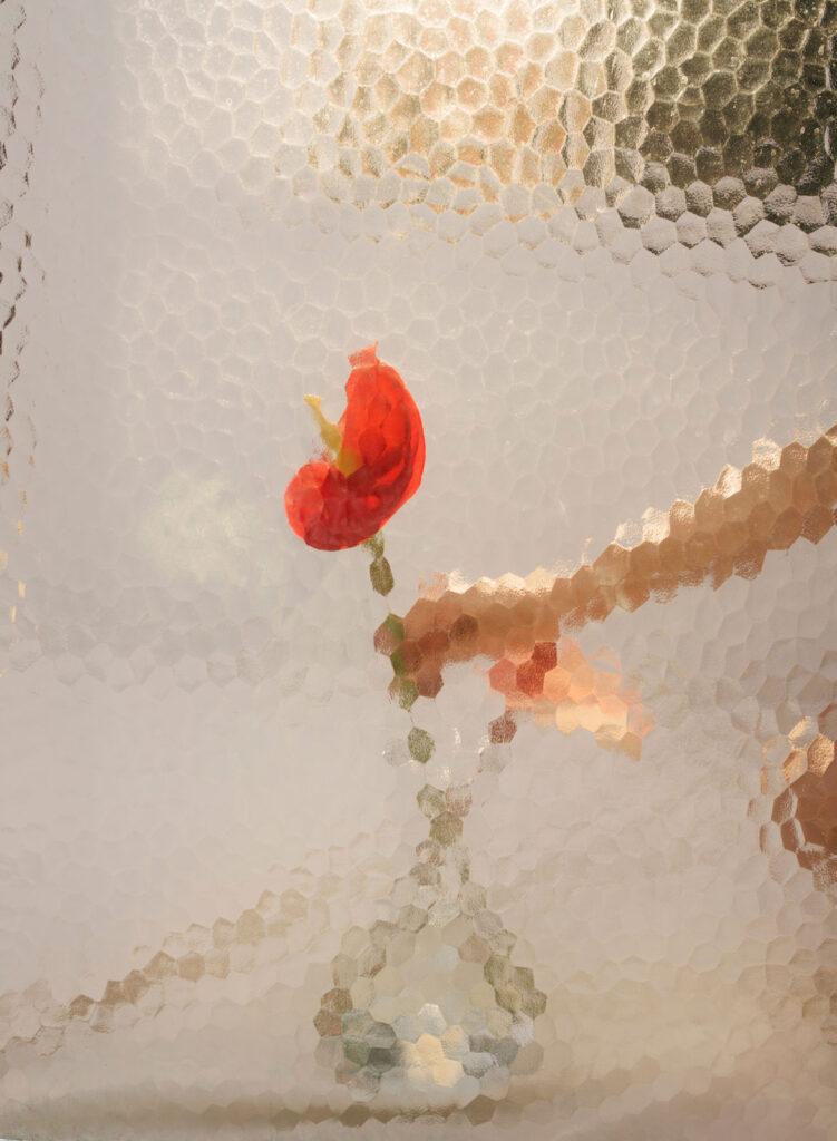
As simulated translucent materials became a common design trend in user interfaces (UI), notably adopted by Apple, that effect has expanded into styling of the physical world as well. Frosted glass panes, intentional plastic wrappings, and unnecessary layers of clear film are being added through packaging design, fashion, prop styling, and more for aesthetic appeal.
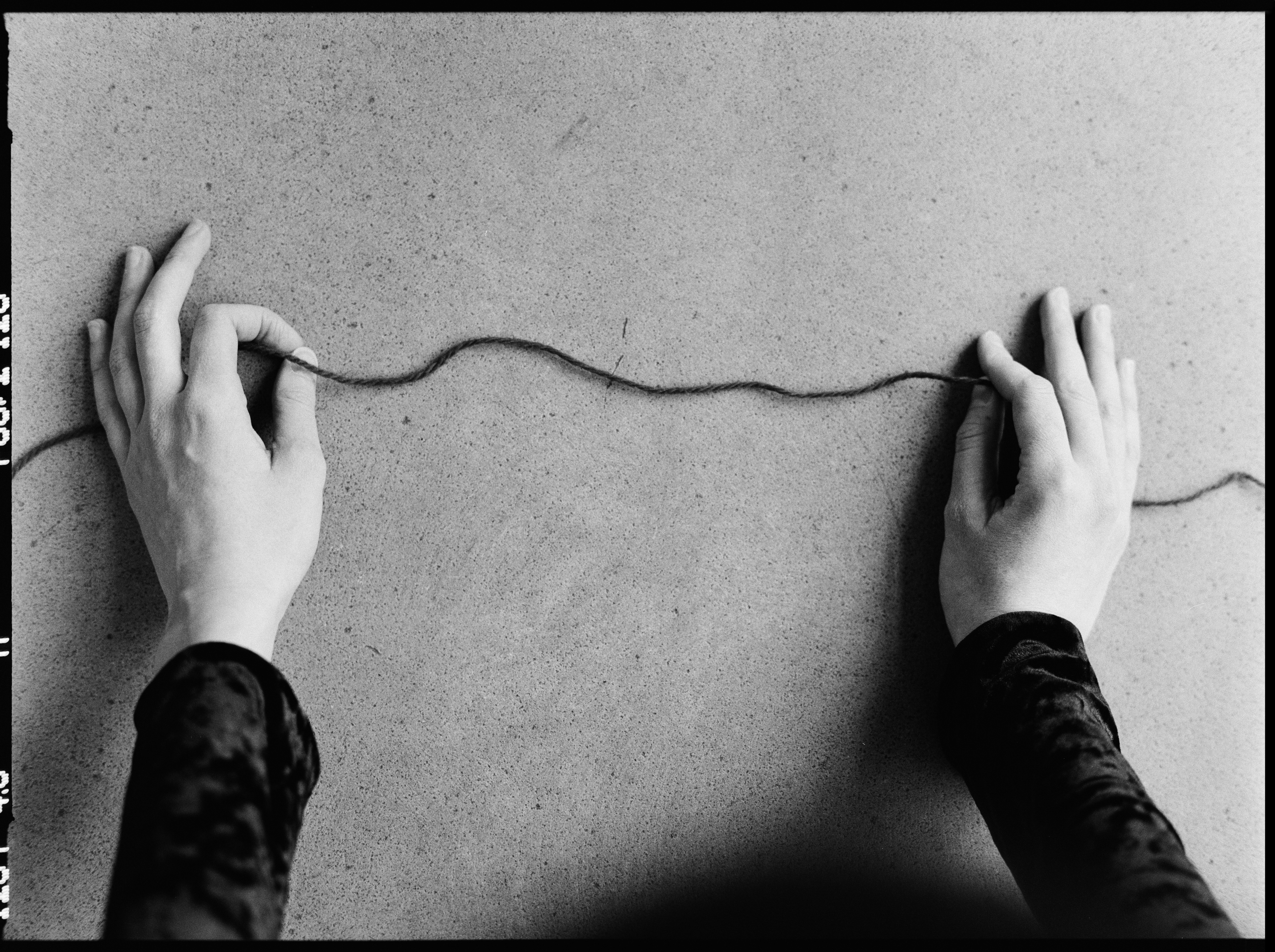
By cropping and selectively covering or revealing subjects, distortion enhances focus. In UI design or product photography, there’s a distinct centering of the viewer’s eye. And even when partially concealed or blurred, that focus is heightened by a sense of mystery and curiosity – what’s behind that frosted curtain?
Material awareness
To some degree, this technique might be a reflection of our increasingly plastic world. With people generally being more aware of how much waste is created through regular consumption, using these materials as design choices can be a reflection of ignorant luxury. In some cases, it’s embraced as Gen X retro — the nostalgic sheen of CD jewel cases representing blissful early-internet naïveté.
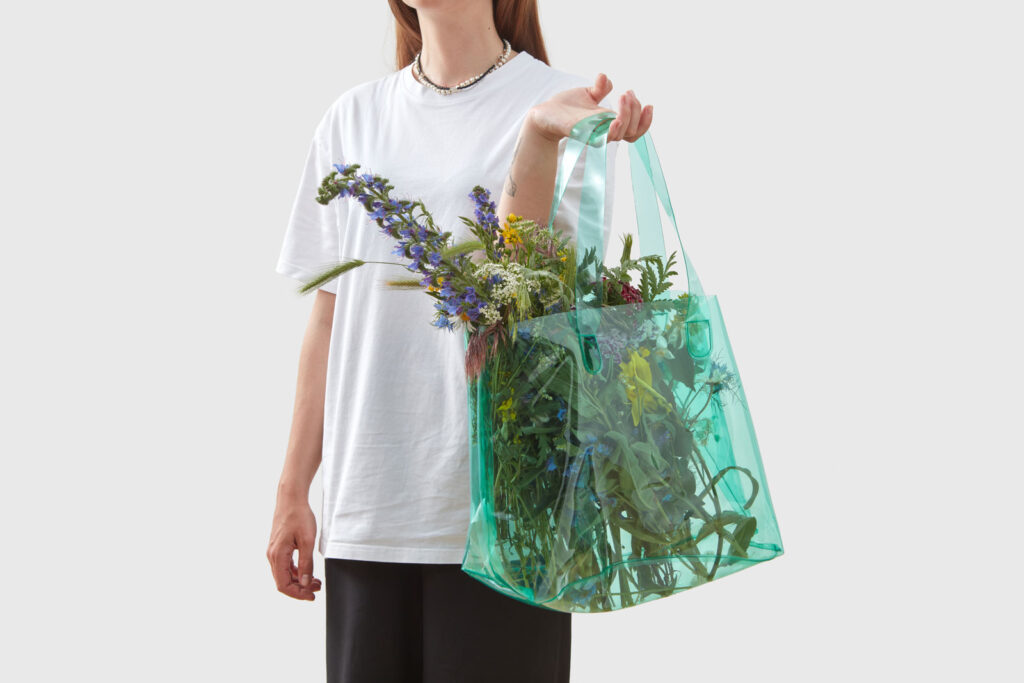
Particularly common in consumer packaged goods (especially in Direct to Consumer branding), materials like vinyl, plexiglass/perspex, and glass bricks are making a comeback as designers challenge what is tasteful versus tacky.
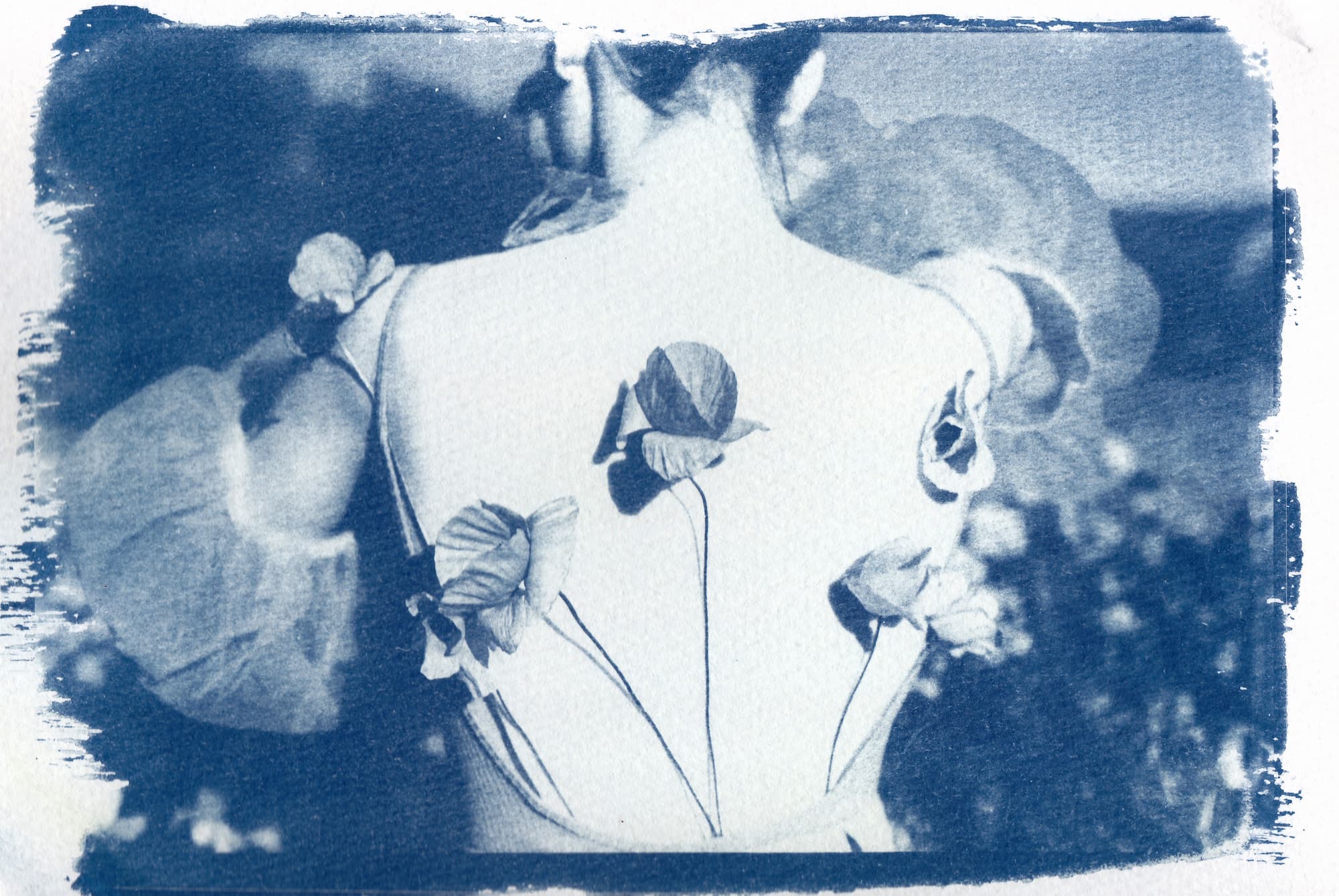
Identity obscured
Translucent barriers used in portrait photography confuse our comprehension of identity in powerful ways. This can be a useful conceptual technique to demonstrate our complicated relationships with personal identity and privacy. It questions how we are seen beyond screens, how we refract ourselves for others’ perception, and how we seek out comfort in anonymity.


Consider the concepts for your brand
Before you shrink-wrap everything in sight, ask what these plasticky perspectives will have on your brand. Consider them to show a self-awareness of your material consumption or how you value transparency. These physical substrates can also be metaphors for personal challenges or privilege disparities. Or use them to create conversations around anxieties of maintaining private identities and personal data protection.
Discover stock imagery with more windows into the world


Aaron Bergunder is an Intermediate Graphic Designer on Stocksy’s Design team, working from Victoria, Canada. He aims to use the practice of design as a tool to build healthier, more equitable communities.