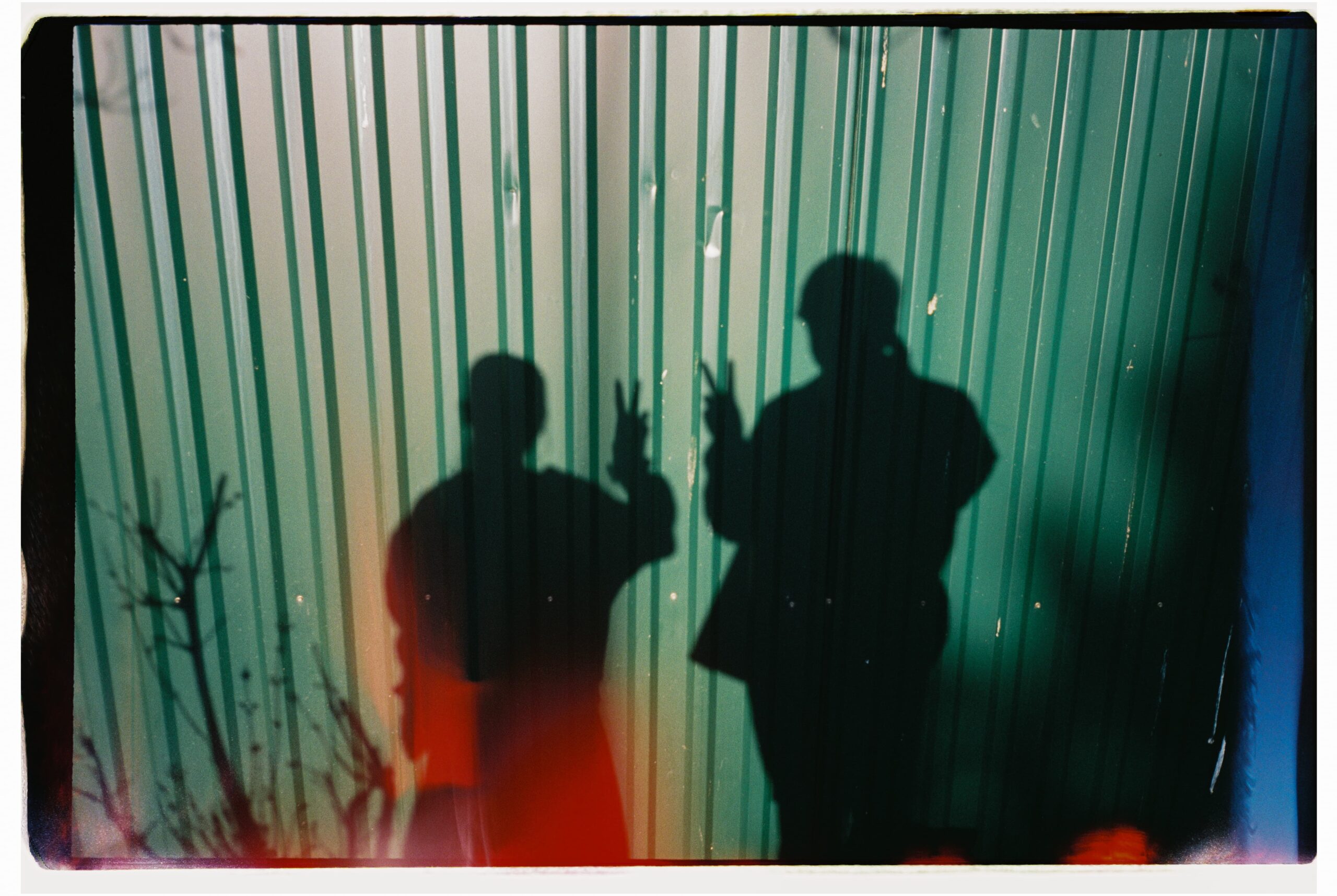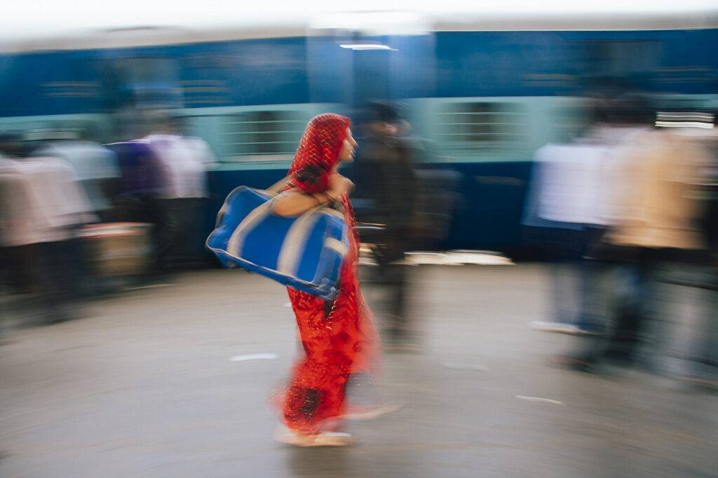
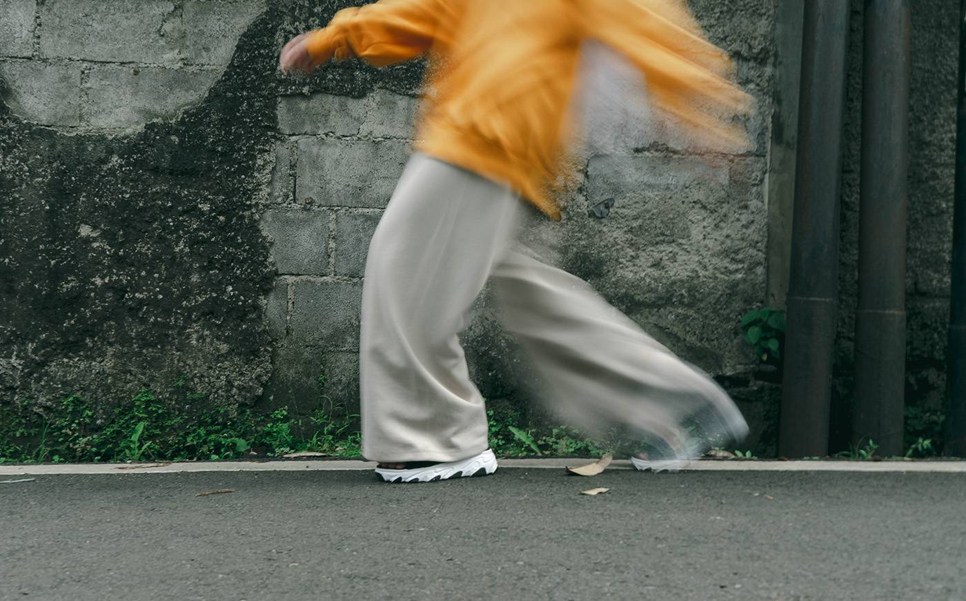
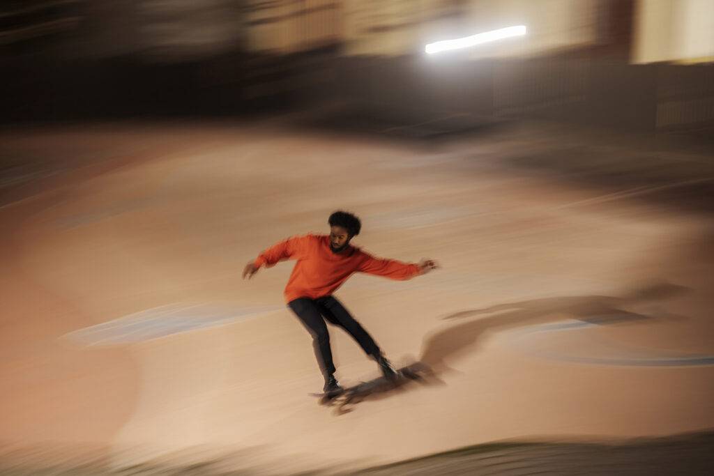
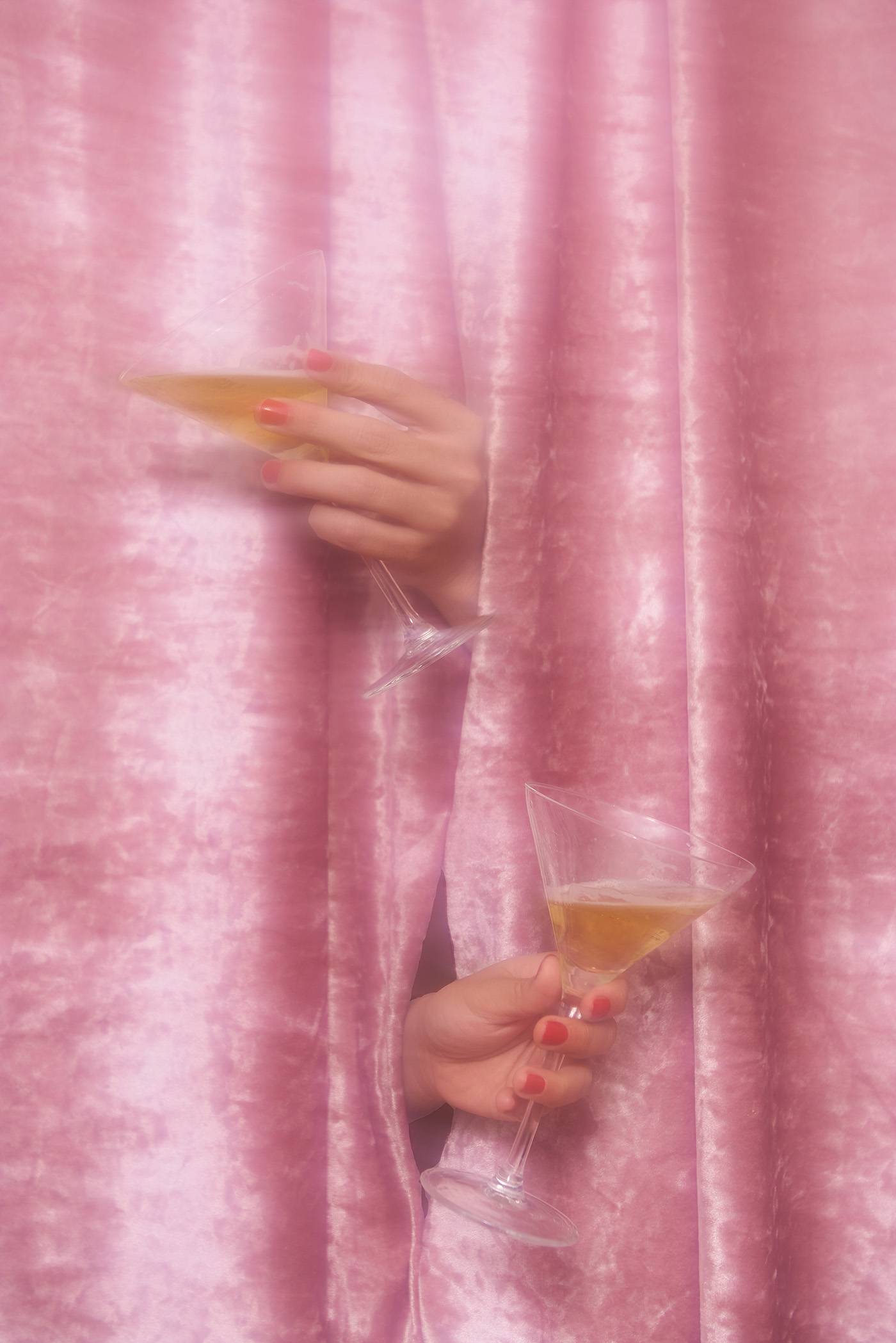
Marketing imagery has taken a distinct turn away from displaying detail, and we’re here for it. Dreamlike blurry photos, videos, and illustrations are setting emotional tones and establishing aesthetics for brands, leaving loads of room for consumer interpretations. It’s like painting impressionistic individuality into your experience — and it’s easy.
Why we’re seeing this blurry trend
On social media, the perfectionist feed has been in decline since its 2017 Instagram aesthetic peak. Overwhelmingly performative and curated displays of life on social media have imploded to make way for authentic expressions of self. And life is messy. Photographer boyfriends have been re-employed. Where blurry celeb selfies were news-making events a year ago, they’re now the norm.
So as that pendulum swings from posed perfection through everyday expression, why not continue that momentum into a form of abstract impressionism?

Focus isn’t the focus anymore
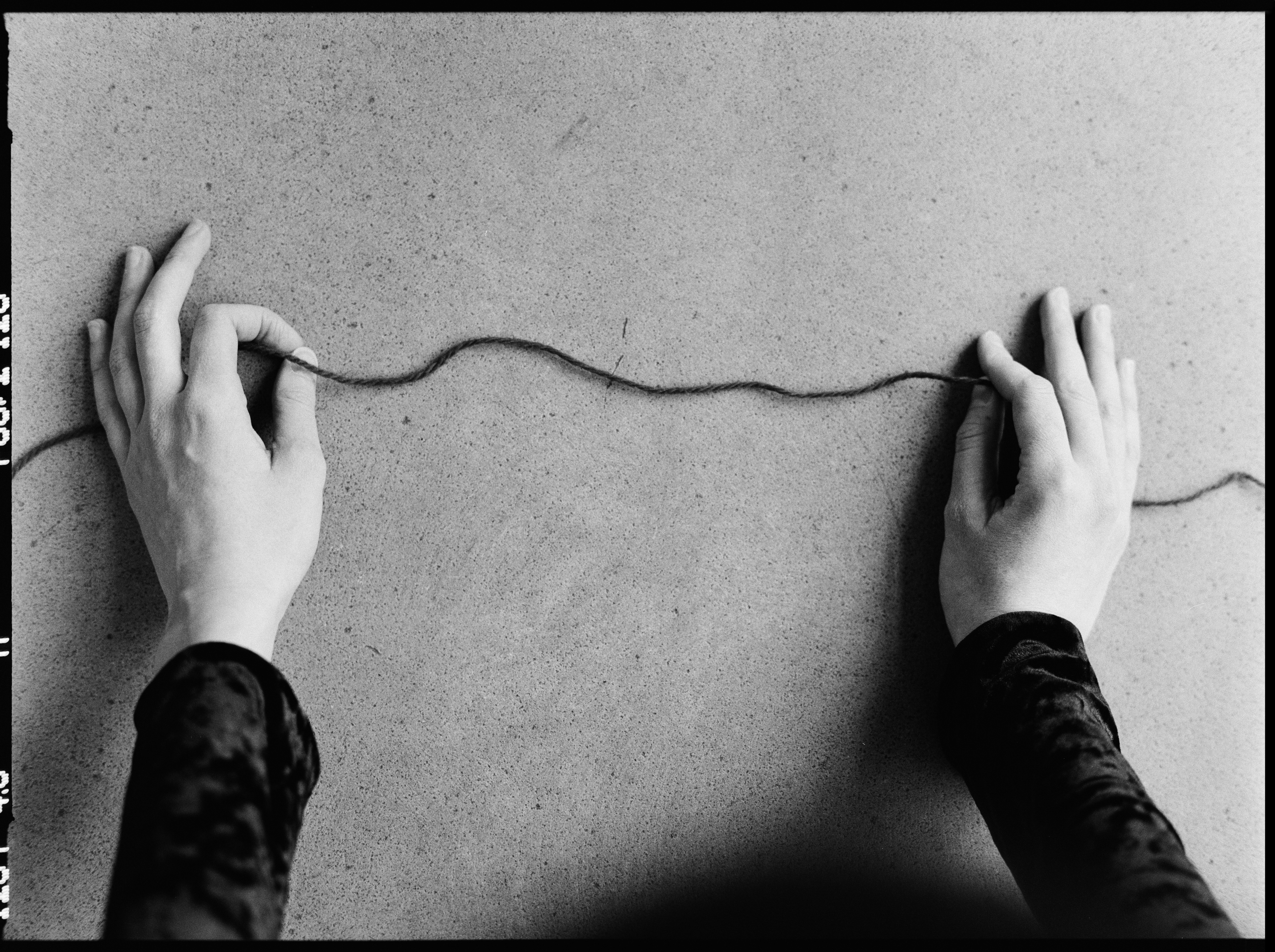
Become inclined to embrace the happy accidents of image-making. Creatives have long found beauty in the abstract — where aesthetic and emotional resonance exist without technical perfection. While our devices might be chasing sharper, brighter, faster reproductions of reality, the arts and our hearts still long for room for interpretation.
Seeking understanding and applying one’s own meaning to the world is a universal human experience. So, if you don’t force a definition upon your audience, you provide a natural space for individual interpretation. Less and less of our culture is concrete — language, identity, aesthetic, work, balance, art, creativity, ownership — the boundaries all continue to blur. But there’s always a pure experience of senses. Living in the moment even if you can’t parse any part of it.
Yes, this is getting conceptual and heady about marketing visuals that may just look blurry at first glance. But it’s about demonstrating the value of beauty being bigger than business.
As a brand, it’s a big display of confidence not just to present a hazy, wavering image of yourself, but to lead with it. In some ways, it’s an offering of respite to your audience. “Here, take a moment with this beautiful abstraction, and don’t think about our products.” A hook of valuable anti-marketing.
Coolpix, bro
And it wouldn’t be Currents without noting a nostalgia angle. In this case, we’re catching the growing trend of Gen Z picking up aughts-era digicams and exploring the technically-terrible photography of their youth. Their childhood was blurry, poorly exposed, with inaccurate colors, auto flash ON, heavily documented, precariously stored on a single hard drive, and eventually uploaded to Facebook. Consumer photography went from point-and-shoot 35mm film capable of pretty remarkable imagery to difficult-to-decipher-at-all digital overnight. But therein lies a charm. Poor as the quality may be, the memories are still powerful. In other words, you can likely expect UGC to get even more “ugly.”
We’re acknowledging that we can’t capture everything happening in every moment around us. It’s an overwhelming world. So let your focus drift and just take in what you can.

Exemplary elegance
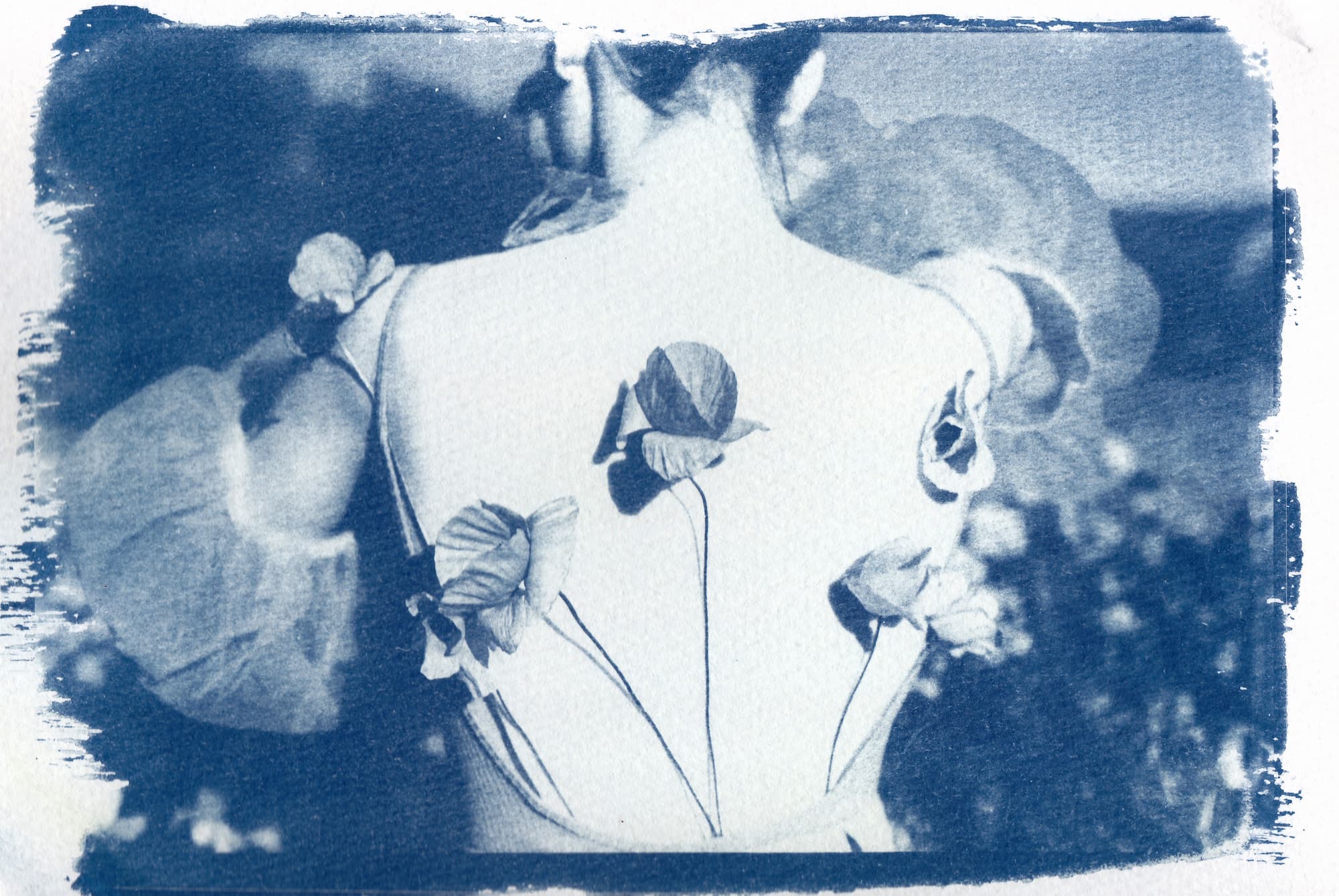
Aritzia’s collaboration with artist Lea Colombo takes the token brand ephemera of the shop bag and elevates it into an art piece sure to be saved and passed on to friends the next time you’re hastily packing up a gift.
Even wedding photographers are seeing requests rise for intentionally blurry photos, suggesting the “perfect day” mentality is becoming more accepting of spontaneity and mishaps to be memorable.
BEFORE ANYONE STARTS RAGING — this isn’t to diminish the strength of technical prowess in imagery, or the impact of accurate, detailed documentary and product photography. Our collection still loves these purposeful achievements and content. But more space is opening up for imperfection to represent our myriad experiences.


How to make it yours
- Think abstract and textural. Bring what is traditionally background imagery to the foreground.
- “Je ne sais quoi” is the whole purpose here. Seek out imagery that has a feeling you can’t quite put a finger on, but moves you nonetheless.
- Bigger is better. Images used like this can become full sensory experiences, where larger displays are more effective at that consuming feeling.
- Consider the concepts: the passage of time, movement, change and shifting dynamics, covering and uncovering.
- Color is key. The wide variety and somewhat neutral content of this type of image means you’re sure to find a match to your brand’s palette.